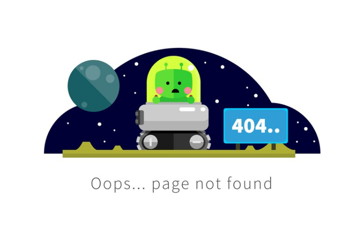
The dreaded 404 error page often signals a dead end in the user’s browsing journey, eliciting groans and frustrations. However, some creative web teams have taken this as a challenge to flip the script. They’ve crafted 404 pages that not only mitigate irritation but provide a unique brand experience. This article showcases ten such examples where encountering a 404 error becomes a fun and memorable adventure.
Surprisingly Fun 404 Pages: Top 10 List
Discovering a 404 page can often lead to annoyance, but it doesn’t always have to be a disheartening experience. Imagine being greeted by a burst of creativity and humor just when you least expect it. That’s exactly what some innovative companies have achieved. They’ve transformed the typically mundane error page into a delightful detour. These companies deserve a round of applause for their ingenious approach to turning a simple navigational hiccup into a moment of light-hearted fun that leaves a positive, lasting impression on their visitors. It’s a clever twist that converts a potential site exit into an entertaining pause, proving that even in digital mishaps, there’s room for a smile.
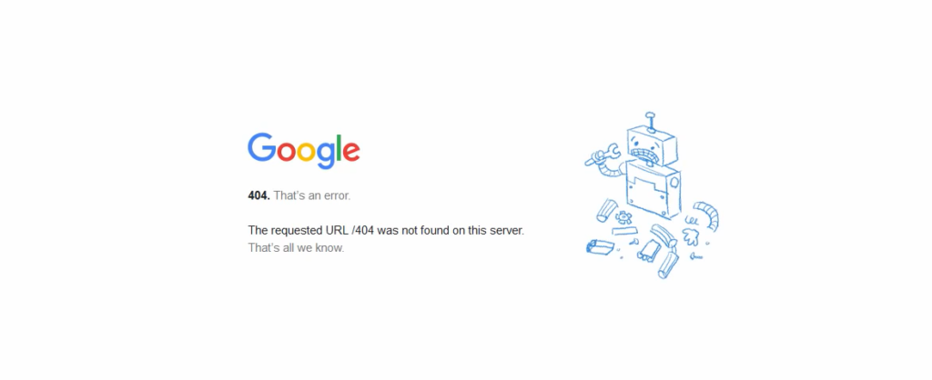
Encountering a 404 error page might initially prompt a moment of confusion, but it’s essentially a signpost that you’ve reached an uncharted area of the web. And who better to clarify this than the internet giant itself? With a simple query, Google elucidates that a 404 is a digital ‘no man’s land,’ and does so with the ease we’ve come to expect.

MailChimp
In the realm of digital creativity, companies have seized the opportunity to brand their 404 pages with distinct personality. Take MailChimp, for example. Their error page is not just a dead end but a showcase of their whimsical brand aesthetic through distinctive illustrations.
HubSpot
HubSpot, known for its inbound marketing wisdom, offers a slice of reality on their 404 page. It’s a gentle reminder that errors are a part of the digital experience, served up with a side of HubSpot’s characteristic practical advice.
Android
Android, on the other hand, turns a potential exit point into a playground. With cleverly placed navigation options and the invitation to engage in a game, Android ensures you’re well taken care of, even when you’ve strayed off the path.
Disney
Disney, ever the master of storytelling, transforms its 404 page into a scene straight out of a movie. With characters like Wreck-It Ralph quite literally breaking the mold, the page becomes an unexpected extension of their cinematic universe.
Arent Fox
Law firm Arent Fox cleverly plays on their name, presenting an ‘Errant Fox’ on their error page. It’s a witty twist that pairs a legal pun with the charming imagery of a fox, weaving in a touch of nature into the digital landscape.
Fish & Richardson
Fish & Richardson, perhaps inspired by their name, could opt for an aquatic-themed error page that would speak to their identity while providing a memorable visitor experience.

GeoEngineers
GeoEngineers takes a more thematic approach, with imagery that resonates with their field of work. Despite some navigational challenges, their 404 page stands out with its eye-catching design and clever marketing copy that aligns with their brand.
Clockwork
Finally, at Clockwork, the love for canine companions shines through on their 404 page. A snoozing puppy not only captures the hearts of fellow dog enthusiasts but also offers a moment of ‘paws’ and relaxation in the midst of web surfing.
Conclusion
These companies have transformed a technical hiccup into an opportunity for brand storytelling and customer engagement. Each 404 page, unique in its approach, reflects the essence of the brand while offering a playful nudge back to the right track. It’s a brilliant way to turn a momentary setback into a memorable encounter.